
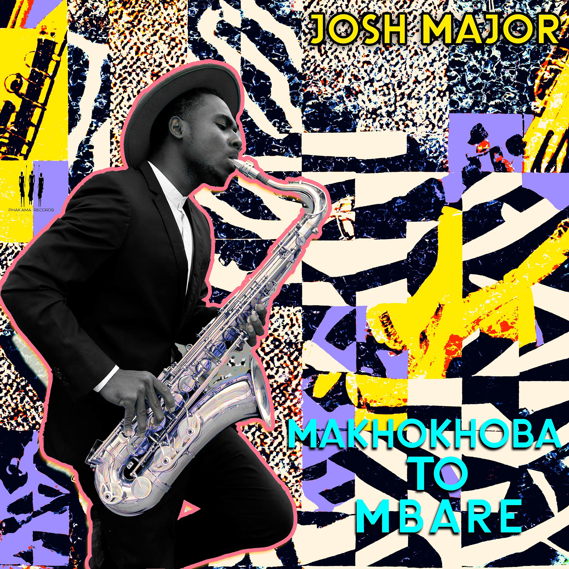
Makhokhoba to Mbare is more than a musical project—it’s a cultural passage. It charts a sonic journey between two historic townships: Makhokhoba in Bulawayo, Zimbabwe, and Mbare in Harare. These are not just geographic points but vibrant cultural hubs where music, art, language, and identity collide in everyday life.
The project is rooted in the lived experiences of the people who call these places home. It draws from the pulse of the streets—the cadence of conversations, the rhythm of daily hustle, and the echo of communal resilience. It’s a celebration of heritage, an acknowledgment of struggle, and a forward-looking exploration of what it means to belong, create, and express.
Makhokhoba to Mbare is about sound as storytelling and how music can carry the weight of memory while making space for new narratives. This project set out not only to be heard but to be felt—intimately and collectively.
In designing this project, I consciously rejected the expected visual formulas often found in music promotion. Rather than focusing on portraits or leaning into genre-specific aesthetics, I sought to capture the emotional and cultural landscape from which this music emerged.
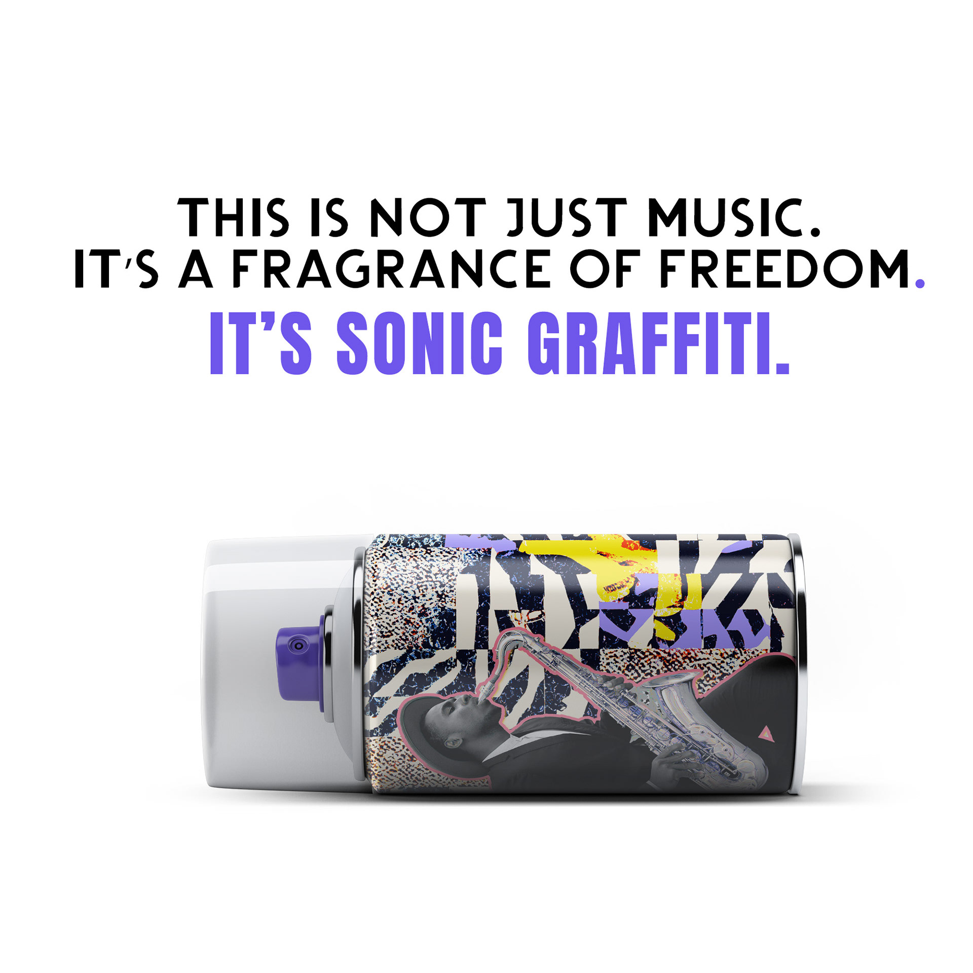
The central question became: What if music could be more than audio—what if it could be worn, touched, inhaled? That curiosity led to the concept of sonic graffiti—where sound and street art merge, giving music a physical form and presence. In this world, a spray can become a transmitter of rhythm, emotion, and story. It becomes a symbol of both rebellion and beauty, echoing the role of graffiti as a voice for the unheard.
The visual direction blends minimalism with grit and modern structure with raw texture. Packaging elements are inspired by personal care products, transforming the album into something you carry with you, apply to your daily life, or share as a form of identity. Typography, layout, and material details all work in harmony to invite curiosity and provoke interaction.
This design doesn’t just represent the music—it embodies it. It aims to mirror the cultural tension and harmony of the townships: the collision of tradition and innovation, the quiet dignity behind bold expression.
Released through Phakama Records, this is not merely a visual campaign—it’s a cultural gesture. A tribute to the places that shaped the sound and to the people who continue to redefine what it means to be seen, heard, and remembered.