

CLIENT: Phakama Records
ART DIRECTION & DIGITAL MANIPULATION: Colo Nyathi
ART DIRECTION & DIGITAL MANIPULATION: Colo Nyathi
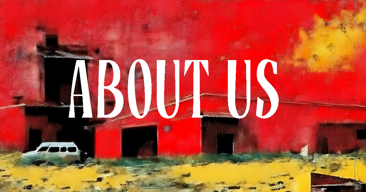
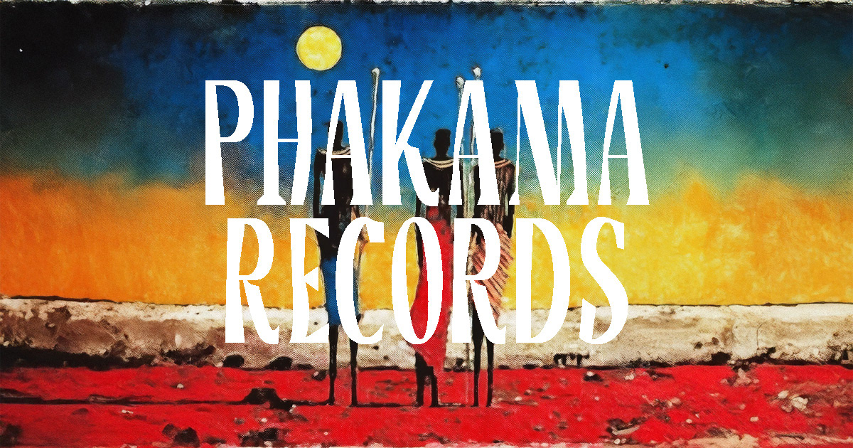
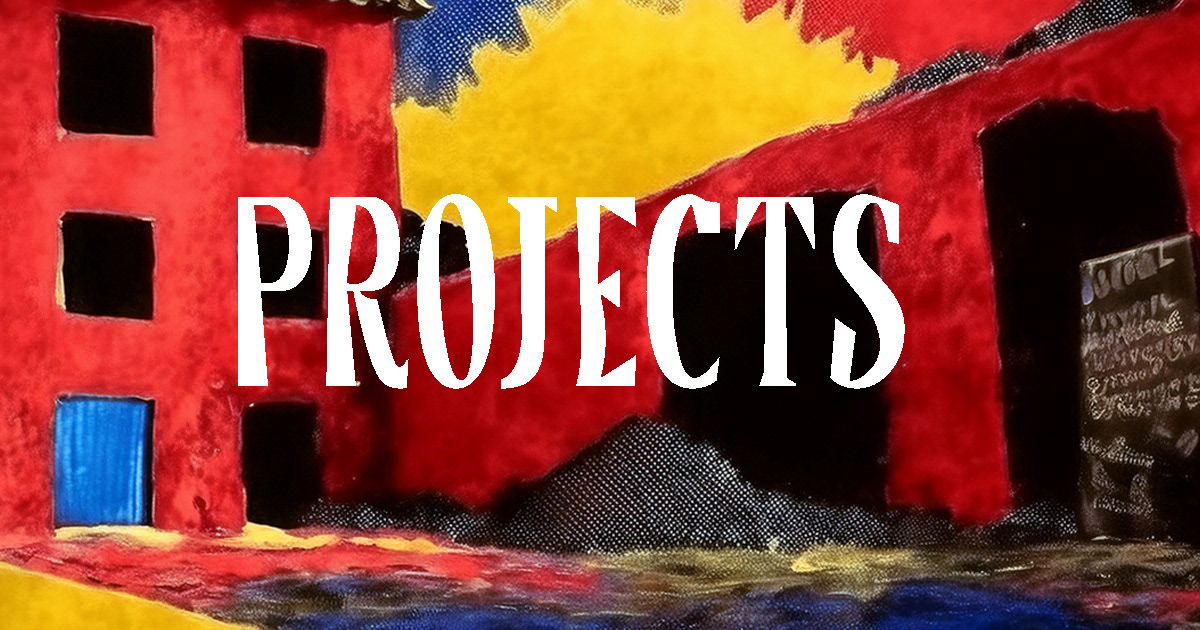
The Phakama Records website is a study in purposeful simplicity, a space where clarity and authenticity shape every pixel. Its minimal layout foregrounds the brand and its projects, stripping away ornamentation to place music and artists at the centre. Large, bold typography commands attention against spacious, unhurried backgrounds, communicating authority with quiet confidence. By removing visual clutter, the site invites the viewer to linger, absorb, and connect with the content on a deeper level.
Navigation is subtle yet deliberate, resting unobtrusively at the top, guiding without distracting. The result is a digital environment that feels both modern and timeless — a canvas where the power of music and identity is allowed to speak freely.


VISUAL CONCEPT
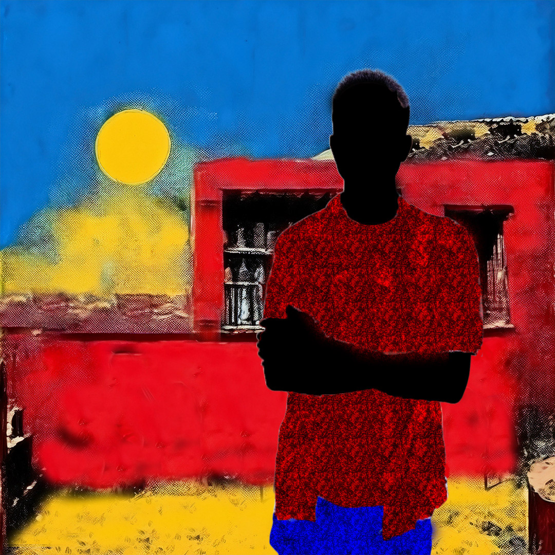
The design reflects the label’s mission: to elevate voices and spotlight creative expression without interference. The visual field is intentionally spare, allowing cover art, artist imagery, and project titles to carry their emotional weight. Negative space is treated not as emptiness, but as rhythm and pause — a visual echo of music itself.
Typography anchors the identity of the site. A bold, sans-serif display font asserts the name PHAKAMA RECORDS with weight and permanence, while lighter, complementary fonts provide contrast for menus and body text. The scale of the title text serves as both a logo and a declaration, ensuring immediate recognition.
A monochromatic base palette conveys seriousness and professionalism, while subtle textures and background imagery nod to urban culture and lived experience — rooting the brand in place, story, and purpose. The site becomes more than a hub; it is a visual extension of the label’s sound, standing with quiet strength in its simplicity.