CLIENT: ALAN COLONNETTI
ART DIRECTION & DIGITAL MANIPULATION: COLO NYATHI
VISUAL DESCRIPTION
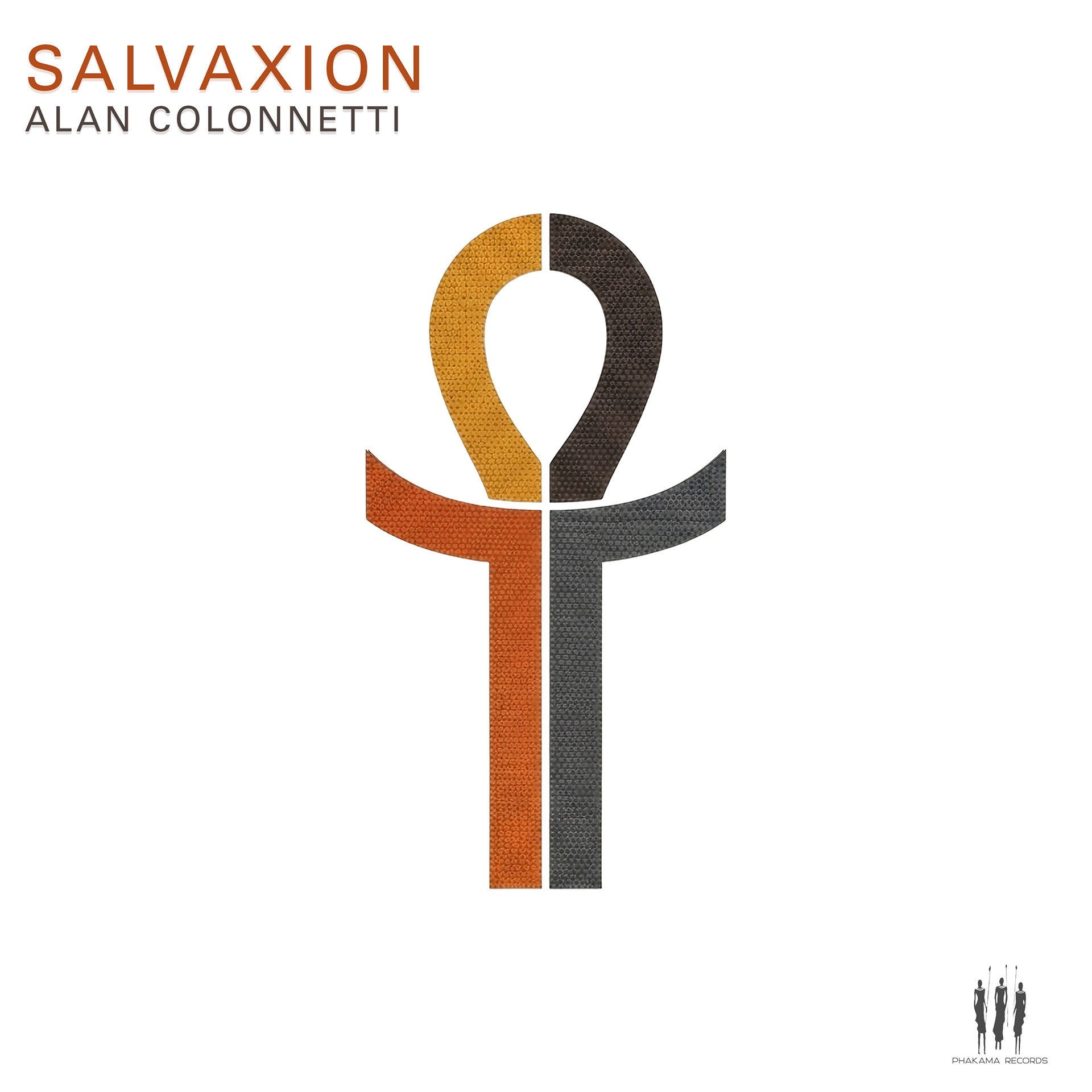
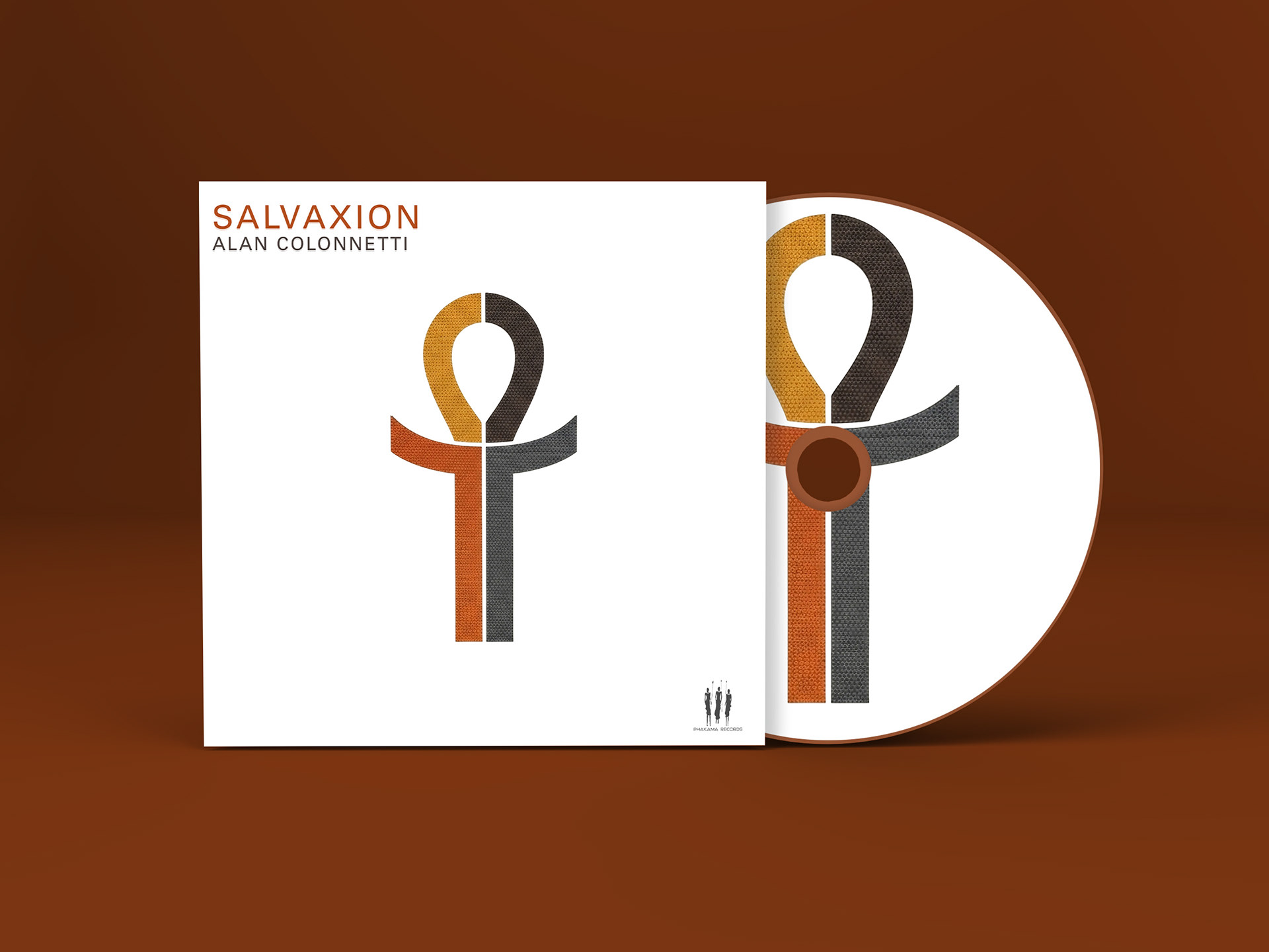
Salvaxion is a visual meditation on balance, reconciliation, and the quiet strength found in unity. When approaching this artwork, I intended to strip the image back to its most essential form, allowing symbolism and restraint to carry the narrative rather than excess detail.
At the centre stands a stylised ankh-inspired form, divided yet perfectly aligned. The symbol functions as both a spiritual reference and a human abstraction — arms extended, body grounded, form upright. It speaks to preservation, continuity, and the idea of life sustained through equilibrium rather than dominance. This is not a figure in motion, but one in resolve.
The colour palette is deliberately restrained and earthy: warm ochres and rust tones balanced against charcoal grey and deep black. Each colour occupies its own space while remaining interdependent, reinforcing the theme of duality without conflict. The vertical split suggests contrast — light and shadow, past and present, tension and harmony — yet the form remains whole.
Texture plays a subtle but important role. The woven, tactile surface gives the symbol a physical presence, grounding the spiritual reference in something human and tangible. Against the white negative space, the symbol is allowed to breathe, commanding attention without noise.
The title SALVAXION appears clean and modern, allowing the artwork to remain the primary voice. The artist’s name sits with equal restraint, reinforcing identity without competing with the symbol itself. The overall composition favours clarity, stillness, and intent.

Visual Concept
Salvaxion is centred on faith and the idea that God is the only source of salvation. The symbol at the centre closely resembles the ankh, a long-standing sign of life, which I used here as a spiritual reference rather than a historical one. It felt like the right form to express life, belief, and something greater than the self.
The symbol stands upright and steady, meant to feel unmovable. It represents God as constant and present, not something temporary or emotional. The vertical line suggests a connection between heaven and earth, while the horizontal shape opens outward, echoing the concepts of sacrifice, grace, and divine reach. Salvation, in this context, is not something that is earned or chased, but rather something that is given.
The colour split reflects the human condition — division, doubt, and struggle — but the form itself remains whole. This was important. Even with contrast and difference, the symbol does not break. It reinforces the idea that wholeness and redemption exist only through God, not through human balance or control.
The space around the symbol is intentional. It creates silence and stillness, allowing the viewer to sit with the image rather than be pushed by it. This mirrors the message of the song: salvation is calm, absolute, and centred in belief.
Salvaxion is a statement of faith. It is simple, direct, and grounded in the belief that life and salvation begin and end with God.